|
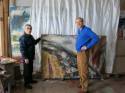
Victor Ivanov's Studio, Moscow, May 2007.
|
|
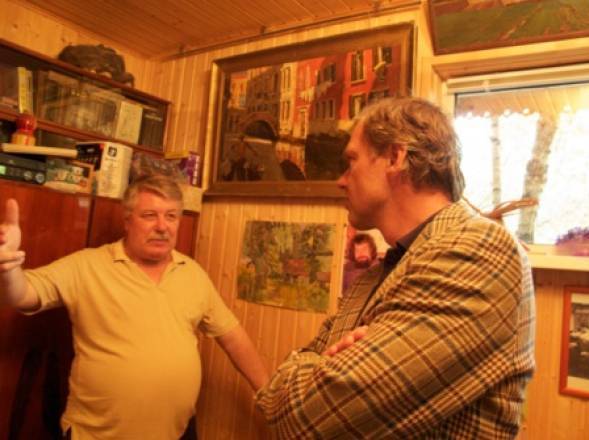
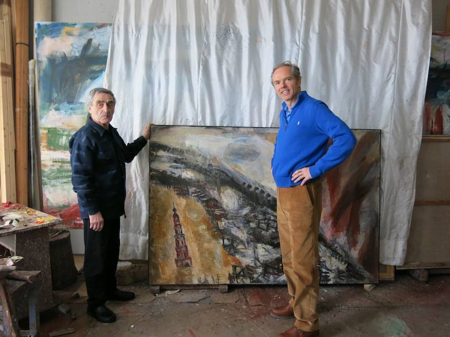
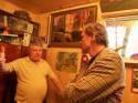
Ivan Lindsay with the late Sacha Stozharov in Vladimir Stozharov's Dacha outside Moscow April 2009
View further details  |
|
Ivan Lindsay with Sergei Tkachev at his home, Moscow, 2007.
View further details |
|
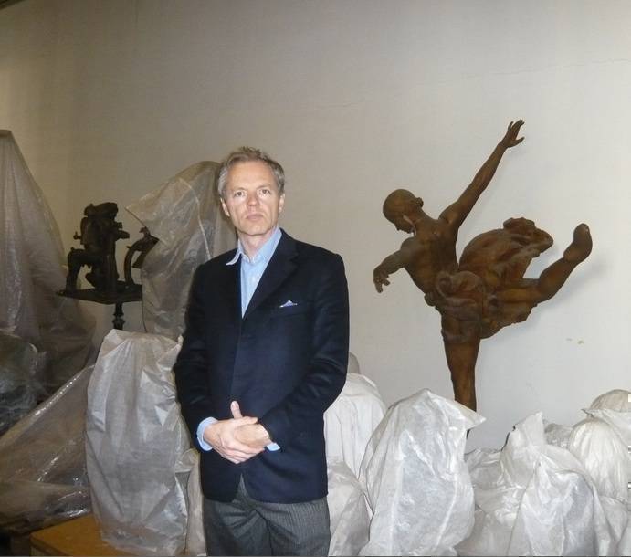
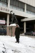
Ivan Lindsay in front of Evgeniy Vuchetich's 'Let us Beat Swords into Ploughshares' bronze outside the Tretyakov Gallery, Moscow, February, 2011
View further details |
|
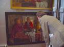
Tatiana Plastova in front of Arkadi Plastov's 'Tractor Drivers,' Moscow, April, 2011.
View further details |
|
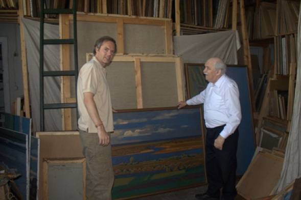
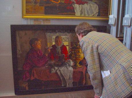
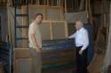
Stozharov - Ivan Lindsay examining a rare interior with figures round a table, October 2007
View further details |
|
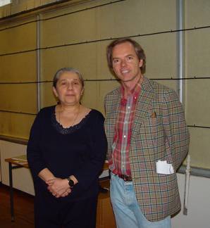
Ivan Lindsay with curator Natalya Alexandovna in the Tretyakov Gallery, Moscow, circa 2007
View further details |
|
Ivan Lindsay in the basement of the Tretyakov Gallery with Yanson-Manizer's 'Galina Ulanova' as Odette.
|
|
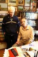
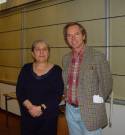
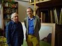
Pavel Nikonov and Ivan Lindsay
View further details |
|
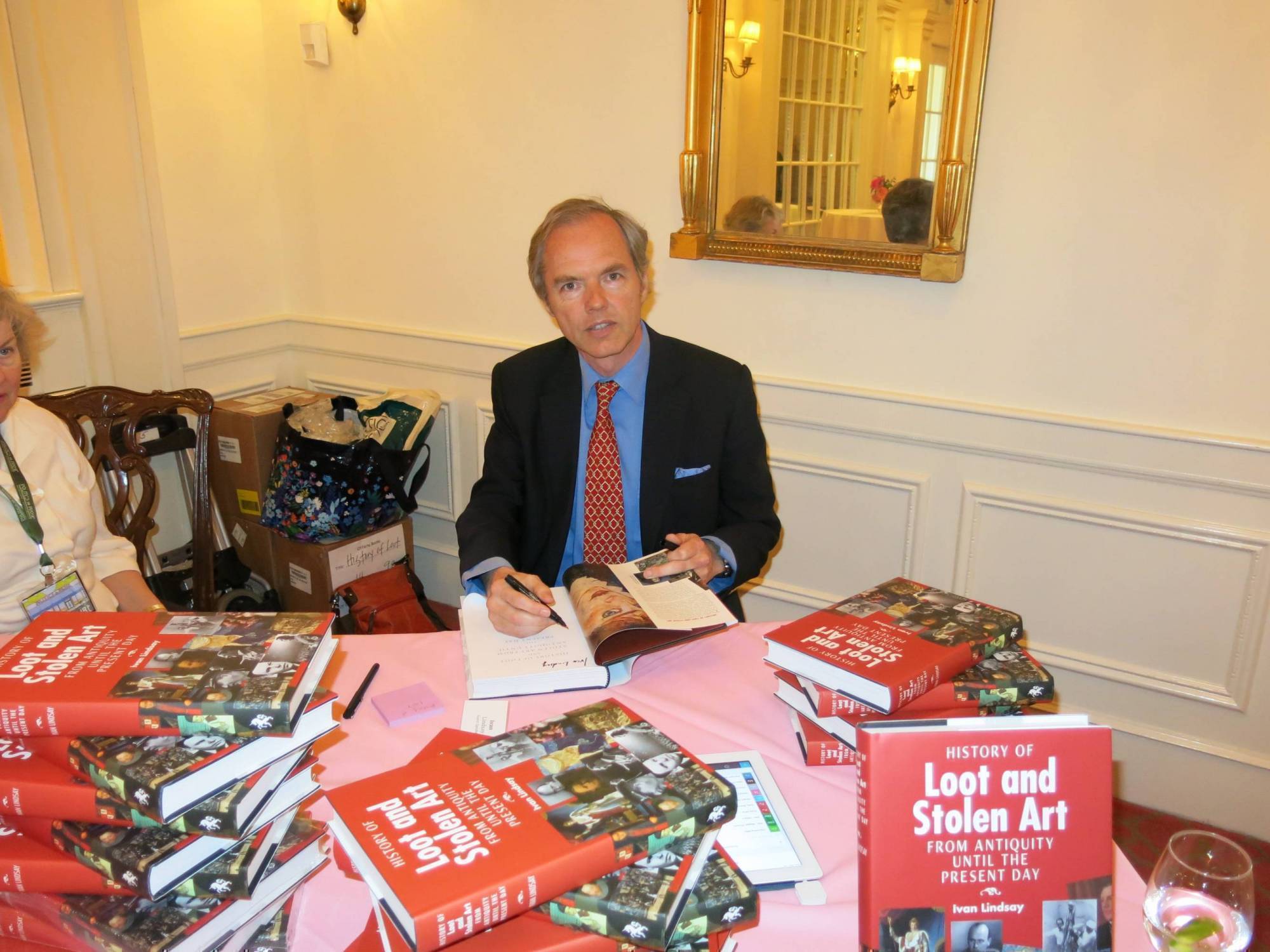
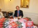
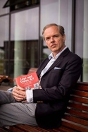
Ivan Lindsay signing books in Washinton DC
|
|
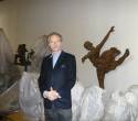
Ivan Lindsay with Valentin Sidorov in his Moscow Studio
|

|
Ivan Lindsay at the York Festival of Ideas in June 2015
|

|
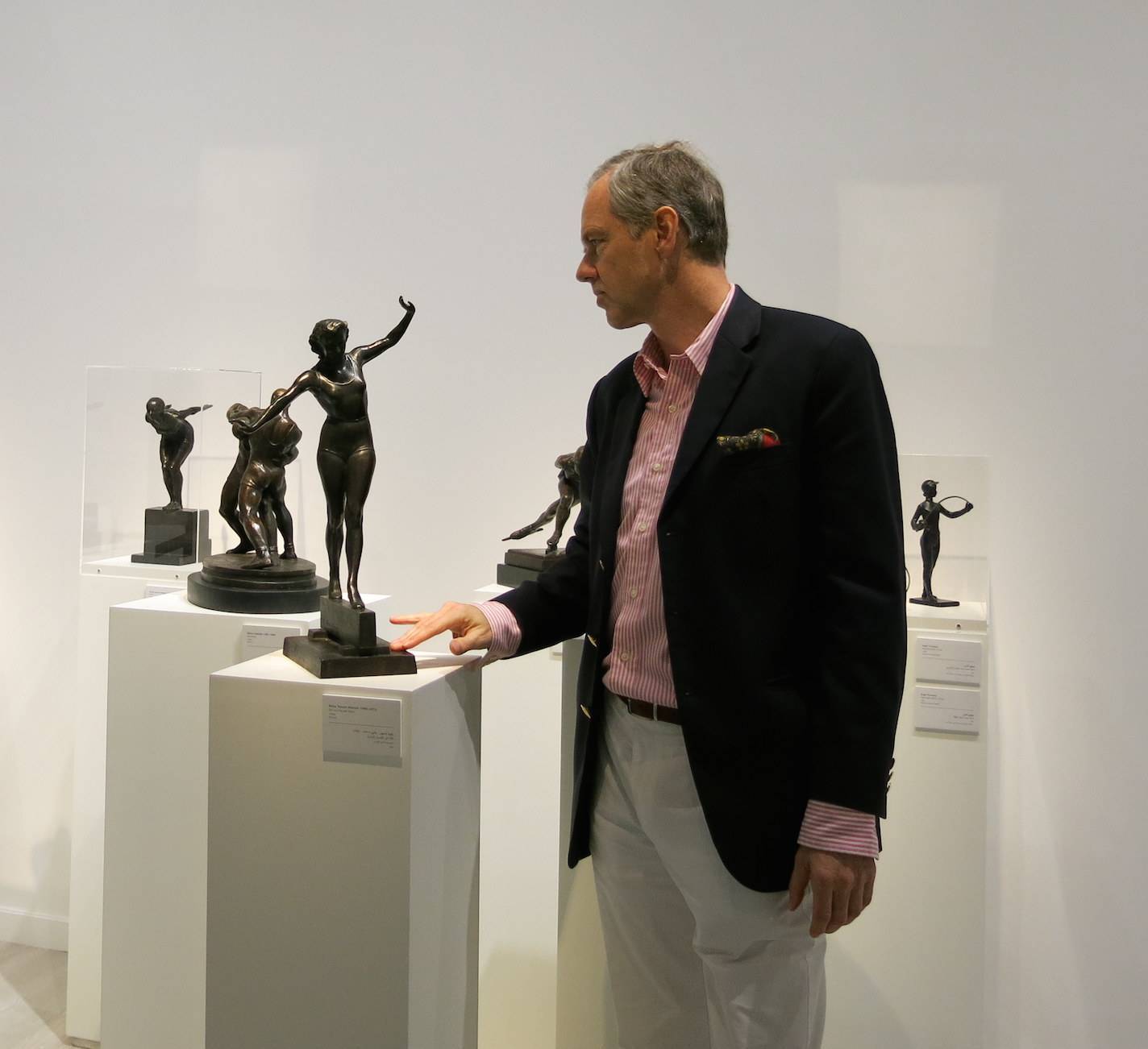
Ivan Lindsay admiring Elena Yanson - Manizer's 'Girl on a Bar' bronze (1950's) at the Art Russe exhibition in Abu Dhabi
|
|
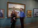
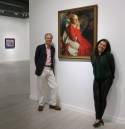
Ivan Lindsay and Rena Lavery at the Art Russe Soviet Art exhibition in Abu Dhabi
|

|
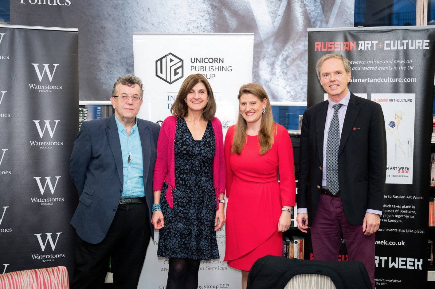
Ivan Lindsay, Theodora Clarke, Margy Kinmonth, John Milner at the Roundtable discussion '1917: 100 years on, Reflections on Art in the Soviet Union' at Waterstones bookshop in Piccadilly on 10th October, 2016.
|

|
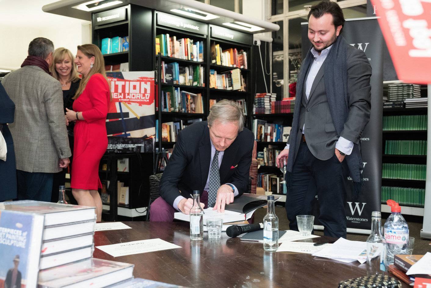
Ivan Lindsay signing his new book at Waterstones bookshop in Piccadilly
|
|
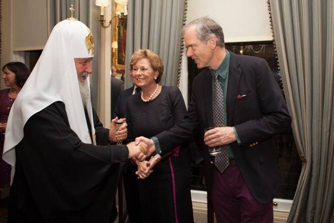
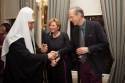
Ivan Lindsay and Lady Olga Maitland welcoming Patriarch Kirill of Moscow at the Cavalry and Guards Club in Piccadilly
View further details |
|
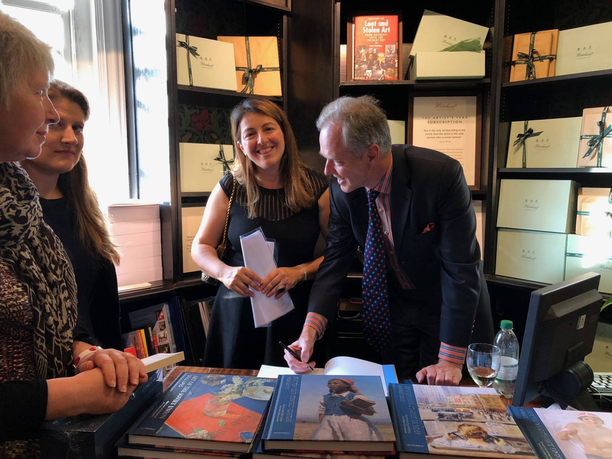
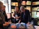
Ivan Lindsay and Rena Lavery at Hatchards signing copies of The Art of Soviet Russia
|
|
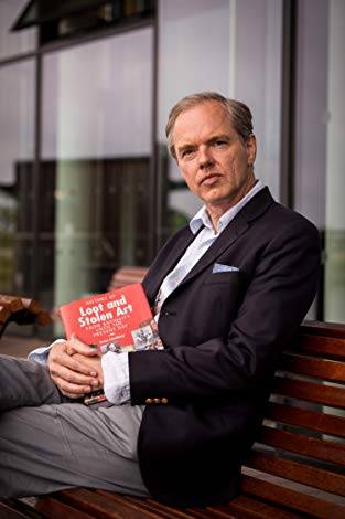
Ivan Lindsay lecturing on Stolen Art at the York Festival of Ideas in 2014
|